Thursday, December 23, 2010

Moss carpet for your bathroom

A moss bathmat. This just seems like a horrible idea. You can't clean it and moss bits would stick to wet feet. Seems like it would be better mounted to the wall. Better yet, just leave it outside.

Inspiring White Walls

From Desire to Inspire, all I can say is wow.

Wednesday, November 17, 2010

The 10 Best Ways To Green Your Apartment Rental | Apartment Therapy Re-Nest

Apartment Therapy House Tour: Samuel Genthner'...Image by *caramimi* via Flickr
Apartment Therapy is one of my favorite places to stumble around on (not to mention stumbleupon.com, but that's another post) and I've come across many posts on the nuts and bolts of being green. This particular post gives great information and links geared to renters, but the information is also perfect for home owners. If you need a little guidance on where to begin being green at home, this is a good place to start.
Enhanced by Zemanta

Friday, November 12, 2010

Herman Miller Online Store and Lifework

Well, I love me some Herman Miller. I'm very fortunate to have a couple of vintage rosewood Eames Lounge Chairs, one of which I sit in every day. They're from the early '70's and still the most comfortable lounge chairs I've ever experienced.

I know that many of the classic mid-century items produced by Herman Miller have been somewhat overexposed (OK, VERY overexposed) in the media, lifestyle magazines and blogs like mine, but they've never really been out of style. The interior design version of  the "little back dress" or the "navy blazer"...simple and timeless.

Recently Herman Miller has wisely decided to sell its iconic designs online at the Herman Miller Store. If there is anything for me that could be classified as "design porn", this is it!

Herman Miller also has a great blog called Lifework, which profiles various designers, their workspaces and what music they find inspiring. Always thoughtful and interesting, it's definitely worth a look
Enhanced by Zemanta

Sunday, November 7, 2010

Natural Modern

With the theme of  "Natural Modern", a new conceptual space plan has been developed with the goal to create a modern environment that was minimal in concept but included a nod to nature. The space needs to serve different functions from entertaining to casual eating to watching TV, with the goal of warming up what could have been a rather cold small space.


Dark bamboo flooring anchors the space and is broken up with a zig-zag rug defining the living/media room. A sectional sofa is used for TV viewing while the two lounge chairs are used when entertaining for overflow seating. The sectional is intentionally large in scale for this small space, helping to balance the visual weight of the mural wall.  Ironically, large pieces often serve to make a small space feel bigger just by visually being able to accommodate a larger item.

Clean contemporary lines have been contrasted with some unexpected natural elements such as a driftwood side table and cowhide ottoman. Small spaces benefit from furniture that can be used for multiple purposes, and the ottoman can be pressed into duty as needed for extra seating. Dramatic visual impact has been created with the rock photo mural which is immediately seen from the front door and serves as a backdrop to the wall mounted TV.

Just off of the front door is a narrow steel table creating a landing pad for keys and mail. A mirror above allows for a last look before going out.

The modern look continues into the small dining area with a round wooden pedestal table maximizing the space for simple upholstered chairs.

Pared-down shapes combined with natural elements create an environment that is interesting, warm and modern.

Sunday, October 31, 2010

Art for Autumn

I was stumbling around some art websites and came upon this beautiful photo by Raymond Gehman at Art.com.
Not only is it a beautiful visual, but it helps reinforce the idea of autumn in not-so-autumn-like Southern California. What's also great about it is that it comes in many different sizes from 16" x 12" to absolutely monumental at 64" x 48". Any of the larger sizes would be especially effective at creating a singular dramatic impact on a focal wall.

Art.com is a great place to begin any search for art prints and photos.


Sunday, August 15, 2010

Balcony Redesign

I was asked to take a look at a city balcony that the owner felt needed a little help. A small space just off of the living room, the balcony was cluttered, but only needed a little editing and a fresh eye to figure out the best way to show it off. The space functions as an extension of the living room and is used year round. Its also used to spend warm summer mornings sipping coffee while reading the paper (and spying on the neighbors). He'd like to do all of this in a nicer, more modern space.

He already had the tall round glazed pots as well as the square terracotta pots...none of which were planted. He also had a large sansevieria that had outgrown and busted out of its pot that was long overdue for dividing. I suggested using the sansevieria and splitting it between the two square terracotta pots. For the tall glazed pots, new grass-like liriope and purple lobelia would look great. For seating, I recommended upgrading from the existing plastic chairs to a pair of teak and aluminum patio chairs and a sleek round powder-coated steel dining table. The floor needed attention to cover the existing faux terracotta tiles. Interlocking teak tiles would be a great solution.


The final conceptual design. All that needed to be done was editing, making the best of what remained and spending money on some creature comforts. Simple and minimal while remaining warm and functional, this design give the client stylish outdoor coffee sipping (and neighbor spying) for years to come. 
Enhanced by Zemanta

Friday, August 6, 2010

Museum Of Bad Art Gives A Home To Forlorn Paintings : NPR


There is something endlessly charming (and often compelling) about really bad art, and bad art is celebrated at the appropriately named Museum of Bad Art. Usually, but not always, made by people with little or no formal art training, bad art can start out as an expression of love or joy and just end up, well, bad. But sometimes when the art is really bad it can become great. I've been known to trawl thrift stores and garage sales sometimes getting lucky and finding a child portrait looking like "Chuckie" or a way-too-cute animal rendering that is endearing but a little scary. And who doesn't get a little excited when they see a portrait of a clown gone horribly wrong?

So-called "bad art" is fun. It could also be another person's "primitive" or "outsider" or "folk" art, but that's another post. 
Enhanced by Zemanta

Sunday, August 1, 2010

Kitchen Cabinets are Ordered

It looks like we will be getting kitchen cabinets after all! We went ahead and ordered American Classics Cabinets from Home Depot.

The plan was to order stock cabinets to take advantage of Home Depot's 20% off sale, but since the wall cabinets are not stock and are made in a different location from the regular stock cabinets, there was a good chance that the stains would not match. That would not be good. So it made sense to special order everything.

The cabinets are still a very good value, and I still ended up with a $500 discount bringing down the cost to $2,865.00 and they'll be delivered in 2-3 weeks! Custom cabinets would have easily been three times as much and taken twice as long to be finished. Could it be that we are reaching the last phase of this project?!

The AutoCAD drawings show what the kitchen will look like after the cabinets are installed. Drawings are critical tools in design development as they allow you visualize how things relate to one another in space.  For instance, in Option 1 (not shown) I had 30" high wall cabinets that I thought would be perfect for this tiny kitchen. Once I compared the 30" cabinets with the 36" high cabinets in the elevation below, I realized that my initial thought was wrong and that the taller cabinets were the better solution. As a bonus the tall cabinets will offer more storage...always an issue in a small space.


The next part of the kitchen remodel will be ordering counter tops and appliances.


Enhanced by Zemanta

Sunday, July 25, 2010

The Haiti Poster Project

Rebuild, Renew, RebirthImage by andymangold via Flickr
There is a fantastic way to help the people of Haiti who are still suffering in the aftermath of the massive January quake. Called The Haiti Poster Project, many talented artists have donated signed and numbered editions with sales benefitting the good work of Doctors Without Borders. Prices for each edition start at $25 and as each edition sells out, the price for each piece increases to a maximum of around $2,000 for the final work…”supply and demand” in action.


The need for the people of Haiti is still great and will be for some years to come. The Haiti Poster Project is a great way to help people and be rewarded with a work of art in the process. They can be found here as well as on Facebook.

Enhanced by Zemanta

New Direction in Cabinets

After months of waiting for custom cabinets that never arrived, we decided it was time to cut our losses and move forward with cabinets from another source. It was a difficult decision since our cabinetmaker is family and has had a string of bad luck and personal challenges. We decided that removing this burden from him can enable him to focus on more important concerns. Seriously, whether or not we get cabinets is not that important.

It feels like we're off to a new start and we're anxious to get this project done and the budget is getting tight, so we’ll need in stock “off the rack” cabinets. My first stop was Ikea. They have very good cabinets at a great price in an array of styles and the drawers have excellent glides. The down side is that everything needs to be put together. The deciding factor was that none of the wood stains would work with our existing laminate floor, so on to the next source.

Next stop, Lowes. Small selection of basic, but attractive cabinets at a good price by Kitchen Classics. The drawer glides can’t beat Ikea’s, but you don’t have to put them together…a huge bonus!

Home Depot came next, and the winner is their stock American Classics in cognac. Constructed out of solid wood for the raised panel doors and drawers, not only is the color a near perfect match for the floor, but they are 20% off! I grabbed a tear sheet with all of the selections and sizes and went home to lay them out in AutoCAD.  

These cabinets will be fine for our little rental. They look good and seem to be solidly constructed. In my head I had envisioned something a little simpler, a little more “mid-century”, but I won’t be living there. If I was living there, I probably wouldn't match the cabinets to the floor either. They're a little nicer than some other stock cabinets I’ve seen and certainly a step up from the usual white apartment cabinets I’m sure we’ve all had to live with at one time or another. 
Enhanced by Zemanta

Thursday, April 8, 2010

Paint Drama and Bathroom Lath

I'm about done with painting the interior. We're saving a lot of cash by  providing this "sweat equity", but naturally there have been challenges along the way.


I primed all of the new textured drywall as well as all of the existing walls with Kilz. I've always had really good success with Kilz, and all was great until I pulled a tiny bit of blue painters tape off a wall and discovered that the primer wasn't sticking. Further investigation showed that paint was coming off in large patches on two walls in a bedroom as well as a hallway wall. Joy. I ended up borrowing an electric sander and grinding down all of the new primer and old paint. These areas had to be re-textured, repainted with primer and then the final coat. A lot of extra work because I didn't bother to prepare the existing surface. Bad designer! Believe me, I learned my lesson. ALWAYS take the extra time to do the prep work! You'll save yourself a lot of time as well as headache in the process. And besides, you won't look (and feel) like an idiot!


The paint I selected was Behr "Swiss Coffee". Yes, it's a standard color, but it's readily available at any Home Depot; its good quality as well as budget friendly. (I was able to buy five-gallon buckets and go through the contractor check out line and save an extra 10%). This yellowy off-white is actually really nice in this tiny house. The trim and doors will be Behr's "Ultra Pure White', giving a slight contrast to the walls. Since the house will be a rental, the goal is to have a basic color that will appeal to as many people as possible.

The other challenge was the paint finish. Again, since the house will be rented out, I thought it would be a good idea to use a paint that had a sheen to make the walls easier to keep clean, so I went with an eggshell finish (except for the bathrooms and kitchen, which are semi-gloss). I decided to use it on the ceiling as well, again for cleaning reasons as well as making everything easier to paint. Unfortunately, the scraped ceiling didn't cooperate. Even though the ceiling had been textured to match the walls, there were still areas that were far from perfect, and the sheen of the eggshell finish brought much attention to these imperfections. The best solution short of major work on the ceiling was to repaint the entire ceiling of the house in a flat finish. More joy. The imperfections are much less visible now.


I have also learned that I could have used a flat enamel which would have given me the look of a flat paint (which I prefer) with the cleanability of a paint with a higher sheen. Live and learn. I'll be using a flat enamel in my own place after this project is done.


The bathrooms are moving along as well. The shower areas in both bathrooms have been lathed, inspected and approved. The only issue was that some lath had bent and some concrete had oozed into the pocket door space. This area had to be re-lathed and new concrete applied and now all is good. There are always problems that come up and you just have to go with it. There is very little that can't be fixed or adjusted.

Work has started on the electrical as well as the tile. Doors are going in as well. It's finally starting to look like a home!

Friday, March 12, 2010

Public Toilets as Billboards

If you can't get enough advertising wherever you go (do we really need full-color ads on grocery store floors?), another method has been invented to continue this endless bombardment with the "Wow Toilet". It consists of an inner tank with an exterior clear component into which advertisements are inserted. I wonder who thought it might be a brilliant idea to associate a consumable product other than toilet paper with going to the bathroom, but apparently this is starting to catch on.


To me this raises a few questions:

How intrusive has advertising become?
Should a public toilet double as a billboard?
Can't a toilet just be a toilet?

I fear that this might catch on as a "clever" way to decorate in the residential world. I can see it now...little girl bathrooms with an inserted unicorn. Fratboy toilets with centerfolds. American flags hugging the tank (if you've seen flags masquerading as bandannas on sweaty heads, trust me, you'll see them as a patriotic statement on a toilet tank). You get the picture.


The good news is that the water tank has a dual flush option...score one for the planet.

Thursday, March 11, 2010

Drywall is Up


Drywall is finally up, inspected and approved...another milestone in this very long marathon! Corner bead is being added to the window openings and the new drywall is being taped and mudded before its final inspection.

It is always amazing to me the difference drywall makes in the process. Its often difficult to get a feel for a space while it is in the framing stage, but once the drywall is in place the rooms become real and space can be visually recognized. In the room below I created a larger closet and moved back the original wall about 12". In the framing stage visitors weren't able to see much of a difference, but now the room feels much larger now that the drywall is up defining the new space.


With any luck, I can start paint next week. This will be the one "sweat equity" project that I will be attempting and at just the right time. The budget is getting thin and with my labor we should save a substantial sum of money (that has already been spent anyway!)


I was really unhappy to find a crack on the top of the low stucco wall close to the front door. Its been an especially rainy couple of months, and unfortunately, water has leaked into the wall structure swelling the studs, causing the top of the wall to crack. We could re-stucco at an additional cost, but my concern is that it may not be a permanent fix. Plan B is to seal the crack and cap the wall with a simple piece of exterior paint grade wood. Certainly not my first choice, but it is the most practical at this point in the project as well as the budget. You can't always get what you want, but to get to the end sometimes you have to compromise to find a solution that will work with the visuals as well as the budget.

Tuesday, March 2, 2010

"A Single Man" Home For Sale


An LA modernist gem is for sale...the home that served as a background for Colin Firth's character in "A Single Man". Nestled among the oaks in Glendale at the foot of the Verdugo Mountains, the building, designed by architect John Lautner, was ahead of its time with large expanses of glass and a decidedly indoor/outdoor feel. Constructed of redwood, concrete and glass, the two bedroom, one and a half bath residence can be yours for $1,495,000.

Sunday, February 28, 2010

Habitat Homes


Habitat for Humanity will be building three new homes in the Washington neighborhood of Long Beach, as well as refurbishing a nearby residence. This and other neighborhoods in the city have recently received new attention from the City Council now that downtown is well underway in its revitalization. This is a very positive development. For many years it has appeared that the focus of attention was only on downtown at the expense of the majority of residents in other less affluent areas of the city.

When I first moved to Long Beach I lived in a tiny studio apartment not far from the habitat location by Drake Park, so I know first hand that the area can be a little rough. But it is rich in architecture. Many craftsman bungalows, Spanish and colonial revival homes grace the area, but that's for another post.

The groundbreaking was on a very stormy Saturday morning and was attended by Mayor Foster, Councilman Robert Garcia as well as Congressperson Laura Richardson of the 37th Congressional District.


According to the speakers, there will be approximately 100 foreclosed homes in the area that will be purchased with grant money by the city, fixed up and sold to low income city residents. This is a great idea. Empty houses encourage blight and crime. Taking this existing housing resource, fixing them up and returning them to the people who live there will encourage these new homeowners to have more of a steak in their own neighborhoods. This can only benefit the neighborhood and city as a whole.


Currently the site is a muddy vacant lot, but in a few months there will be three new homes for some lucky Long Beach residents!

Friday, February 26, 2010

Better Lighting for Better Living

First of all, I hope you're not using a single light fixture mounted to the ceiling in the center of the room. Not only does it create a stark, unwelcoming, tense visual environment, it makes everyone look older and harsh...not something you should do to someone you love unless you live in an interrogation room.

There is nothing worse for a room or for a gathering than bad lighting. Nothing. Get yourself a couple of table lamps and maybe a floor lamp. You should have at least three areas of light spread out so you can create pools of light that create interest with light and shadow...this softens the look of the room and gives people a more flattering appearance. You may need more lamps, but start with three and experiment.

My best lighting secret is to use a dimmer on every lamp with an incandescent bulb. A dimmer can dramatically change the look and feel of a room just by adjusting the intensity of light. Turn it down very low and you have the effect of soft candlelight and you even save energy in the process. Crank it up and you can do surgery if need be. Ikea has an inexpensive dimmer (called "dimma"....those crazy Swedes) that I use on all of my lamps. Only $7.99.

Take my advice and get a dimmer for each of your lamps. Now. Seriously.

Tuesday, February 23, 2010

New Grocery Store for Downtown Long Beach


The old Vons grocery store serving downtown Long Beach has at last been torn down. Although a critical business for downtown residents, I'm glad to see it go. Although I'm usually a fan of saving old buildings, its functionally obsolete and has been an eyesore for years. The new Vons being constructed will be a great upgrade for the neighborhood and will maximize space in the crowded downtown area by having parking on the roof allowing for a larger store. This will be what any downtown needs and in many cases just don't have...a decent grocery store that serves the local population.

I'm especially happy to see that the design of the building will look upscale and modern, and will not have any Tuscan architectural references which are so common in Southern California. We live in the 21st Century far from Italy! I just wish the builders in South Orange County had been aware of that little fact, but that's another post.

Thursday, February 18, 2010

Unhappy Hipsters

I love modern design and I love Dwell magazine. Sometimes, though, Dwell and it's featured homeowners can take themselves a little too seriously. Here is a site that pokes a little fun at all of that hipster seriousness.


Wednesday, February 17, 2010

Winner at the Villa Riviera

Most of the units open to visit were very nice and you could tell that a lot of thought was put into their overall design. This was not a competition. But if it was I would have to vote for this unit as the absolute winner!


This owner has created a space that reflects his personality as well as doubles as a showcase for his diverse collection of art. A county worker by day and an art collector by night, he is not afraid to use every square inch of wall space to show off his bold contemporary collection. 


Not everyone can pull off this kind of look. All of the art is generally related but is framed differently adding even more visual excitement. Stark white walls highlight the art which gets great light from the mostly northern exposure. Because of the white walls and generous light, the space feels open in spite of all of the art which could have had a claustrophobic effect. This is a fun space that is not overly thought out, feeling like it has grown organically as the collection has grown over time. This is definitely not a "serious" space. 

To keep any feeling of chaos to a minimum, he has wisely grouped similar sculptural items into collections creating a strong cohesive statement.


He has left a few nods to the building's history by leaving the existing wood unpainted and using some vintage light fixtures...see the crystal chandelier in the first photo. Even the window treatments have a vintage feel. This contrasts sharply with the playful subject matter and tone of the contemporary art, creating a tension which makes the space much more interesting.


So many people are afraid to be really "out there", choosing to go the easy route and decorate in a manner that's safe, and end up with a room that's rather pedestrian and dull. I think its great to walk into a room and have some idea of the personality of who created it.  Here is an example of a someone who definitely loves art and loves living with it. The result is an exciting space that's inspiring as well as a pleasure to experience. 

Yes, its crowded. Yes, its quirky.. And yes, its fantastic.

The lesson here: Be bold! Don't be afraid to express yourself!

Sunday, February 14, 2010

Touring the Villa Riviera

Villa Riviera, Pacific Coast Club and East Ocean Boulevard Apartments Postcard

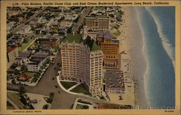
Rarely does the local iconic building, the Villa Riviera in Long Beach, California, open it's doors to visitors. In fact, its only happened once before after it's recent multi-million dollar renovation. I've always wanted to go inside and take a look, and I was excited to finally be able to get the chance.

The outside of the building is spectacular. After the sensitive renovation, the building looks fresh and sophisticated. It's clear that the money was well spent on the outside.

After viewing the impressive exterior, I have to say that most of the common areas are somewhat of a disappointment. The large main lobby lacks any warmth and sophistication, and the furniture is sparse and under-scaled. The hallways are equally underwhelming, feeling dark and dingy with artwork consisting of old prints of well known paintings that are generally cheaply framed. I get the feeling that the bulk of the renovation money was spent on the exterior. Hopefully money can be allocated in the future to freshen up the interior common areas to bring them up to the level of the perfectly executed exterior.

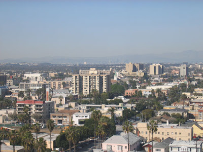
The good news that there were many residents willing to have strangers (and critical designers) trudge through their homes. Most of the units are very nice and all of them have great views! The top units have fantastic panoramas of the Los Angeles basin as well as the Pacific Ocean from the South Coast of Orange County to Palos Verdes and beyond. This photo shows Downtown LA and the surrounding mountains barely visible in the distance.

This photo shows the view down Ocean Boulevard. The round building on the left is the International Tower, another iconic Long Beach edifice. What a treat!

The Villa is also known for its many carved gargoyles surrounding the roof line.

Many of the owners were clearly intent upon keeping with the general design of the building with their own interiors. Generally most of them were successful. Some even appeared to be little changed from the day the Villa opened. This is a source of pride for these owners, although I think I would find it difficult to live a modern city life in a home where one feels like stepping back to 1920 when crossing the threshold. In my opinion, the most successful units were those that did a lot of updating to reflect living in the 21st Century, while letting the building's newly burnished exterior speak to the building's historic past.

One of the renovations that stood out was a tiny unit with a closet-size kitchen. The owners made a dramatic statement in a very difficult space with black granite, white Ikea cabinets and (mostly) stainless appliances. A simple, fantastic solution with a very modern twist. This renovation is clearly a reflection of the young urban couple that makes daily use of it.

I'll be sharing my favorite unit in a later post. Here's a hint...it has nothing to do with the kitchen above!
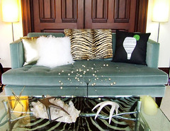