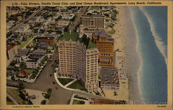
Rarely does the local iconic building, the Villa Riviera in Long Beach, California, open it's doors to visitors. In fact, its only happened once before after it's recent multi-million dollar renovation. I've always wanted to go inside and take a look, and I was excited to finally be able to get the chance.
The outside of the building is spectacular. After the sensitive renovation, the building looks fresh and sophisticated. It's clear that the money was well spent on the outside.
After viewing the impressive exterior, I have to say that most of the common areas are somewhat of a disappointment. The large main lobby lacks any warmth and sophistication, and the furniture is sparse and under-scaled. The hallways are equally underwhelming, feeling dark and dingy with artwork consisting of old prints of well known paintings that are generally cheaply framed. I get the feeling that the bulk of the renovation money was spent on the exterior. Hopefully money can be allocated in the future to freshen up the interior common areas to bring them up to the level of the perfectly executed exterior.
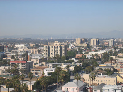
The good news that there were many residents willing to have strangers (and critical designers) trudge through their homes. Most of the units are very nice and all of them have great views! The top units have fantastic panoramas of the Los Angeles basin as well as the Pacific Ocean from the South Coast of Orange County to Palos Verdes and beyond. This photo shows Downtown LA and the surrounding mountains barely visible in the distance.
This photo shows the view down Ocean Boulevard. The round building on the left is the International Tower, another iconic Long Beach edifice. What a treat!
The Villa is also known for its many carved gargoyles surrounding the roof line.
Many of the owners were clearly intent upon keeping with the general design of the building with their own interiors. Generally most of them were successful. Some even appeared to be little changed from the day the Villa opened. This is a source of pride for these owners, although I think I would find it difficult to live a modern city life in a home where one feels like stepping back to 1920 when crossing the threshold. In my opinion, the most successful units were those that did a lot of updating to reflect living in the 21st Century, while letting the building's newly burnished exterior speak to the building's historic past.
One of the renovations that stood out was a tiny unit with a closet-size kitchen. The owners made a dramatic statement in a very difficult space with black granite, white Ikea cabinets and (mostly) stainless appliances. A simple, fantastic solution with a very modern twist. This renovation is clearly a reflection of the young urban couple that makes daily use of it.
I'll be sharing my favorite unit in a later post. Here's a hint...it has nothing to do with the kitchen above!


.jpg)


No comments:
Post a Comment